Bad Formatting Gives Self-Publishing a Bad Reputation
We’ve all seen Word documents with such horrible, inconsistent formatting that it makes reading the document difficult. Transferring that bad formatting to a book feeds the poor reputation self-publishing has endured from the beginning.
In the early days of self-publishing, it was common to see books printed with horrible formatting and spelling mistakes. There is no excuse for it today as we have plenty of grammar software and automatic spell checks for writing what we didn’t master in school. But finding an accurate source for the styles and formatting can be a bit more challenging.
Our Guide Book
If you’re a book designer, it’s crucial that you understand the rules to follow. Do I indent here? Should I let this list flow to the next page? Everyone says different things about ellipses!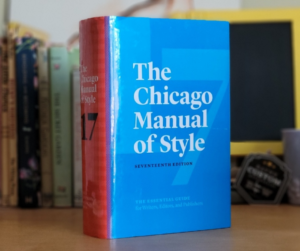
When you are designing a professional book, it is published for the world to see, so it’s important to have consistent, approved design in the book’s interior. We found the best professional resource for our needs is the Chicago Manual of Styles. Our editors base all their work on this book so it makes sense for us to follow it as well.
People judge a book by its cover and then proceed to analyze the interior design as they read. Do you know what to look for?
Book Formatting 101
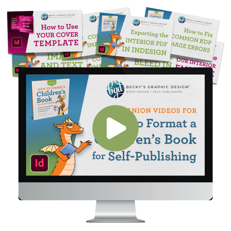
We’ve added some visual examples of common typesetting terms (to help you speak the same language as your book designer), plus some page layout and formatting errors. If you’re an author, take the time to review these rules and make sure the final version of your book is free of these mistakes.
Typesetting Terms
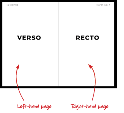
- Verso/Recto
These terms refer to the left- and right-hand pages in a spread
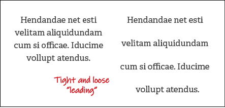
- Leading
The vertical distance between lines of text. Derived from the time when typesetting was done with actual lead block letters
![]()
- Tracking
The horizontal spacing between a range of letters or characters

- Kerning
The horizontal spacing between two individual letters - Typeface
A distinguishable set of letters, digits, and other characters all following the same style. Examples: Garamond, Calibri, Times New Roman, Comic Sans (ew). - Font
A file that contains the images of all characters in a typeface.
Examples: TimesNewRomanRegular.otf, CalibriBold.ttf
Title Pages & Hyphens
As seen in the examples above, “lorem Ipsum” is a long-standing form of filler text, based on modified Latin, but the words mean nothing. If you can translate Lorem Ipsum for me, I’d love to hear it!
Check for:
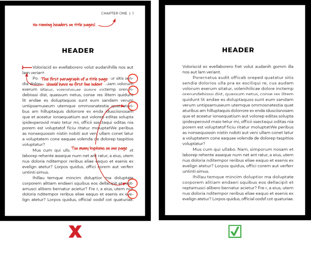
- Running Headers
Also known as the “folio,”—the informative bar at the top of the page which usually contains page numbers, the name of the author/book, or chapter title—should not be present on title pages. - Indent
The first paragraph of body copy shall not have a first line indent. - Hyphens
Hyphens should be reduced and, if possible, entirely removed. If hyphens are necessary, there shall be no more than two to three per page, and never one following another.
Widows, Orphans, & Section Breaks
In this guide, all body copy in the examples is seen as “left justified,” which aligns the text to both the left and right margins, while starting the last lines on the left. This is the standard setting for almost any printed book in existence, as it improves readability.
Check for:
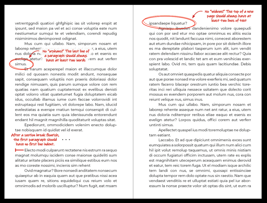
- Orphans
This is the term applied to words that are left on their own line at the end of a paragraph - Widows
This term describes what happens when the last few lines of a paragraph end up alone on the top of the next page. - Section Breaks
At the beginning of any new section—whether that be after a flourish or at the beginning of a new chapter—the first paragraph of body copy shall not have a first line indent.
Lists
Check for:
- List Indent
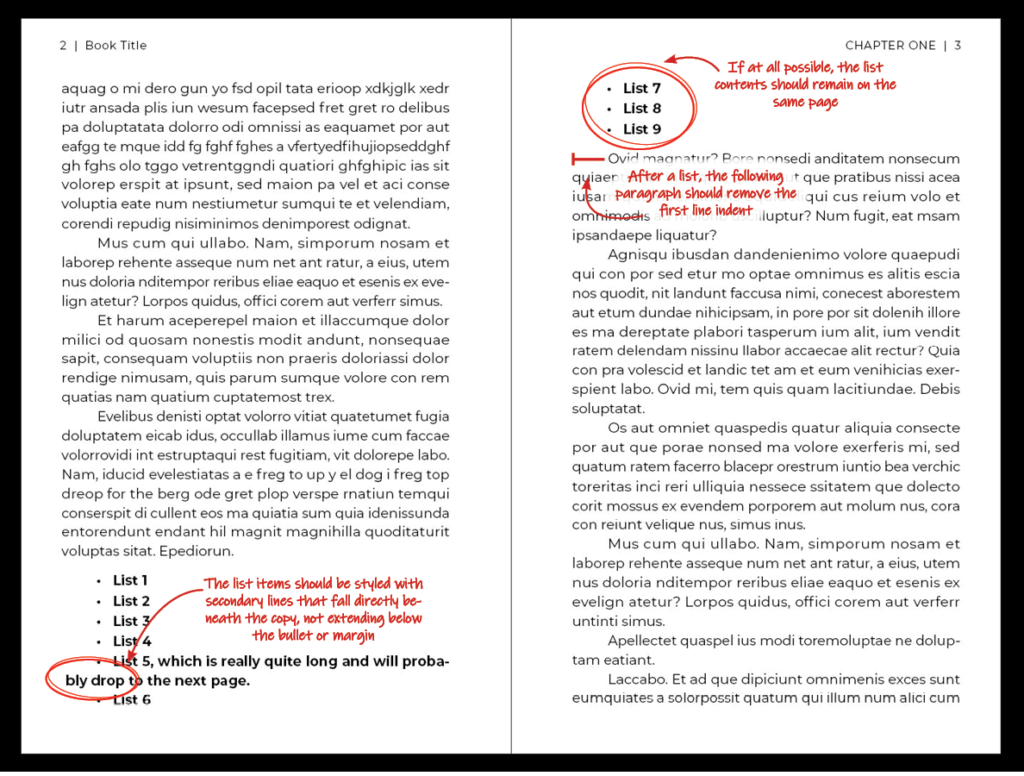
If the list items are long and have more than one line of text, they need to be styled with text aligned beneath the above copy, not extending below the bullet or to the left-hand margin. - Page Flow
If at all possible, lists should not extend to the following page or spread. - After the List
Following a list, the first paragraph of body copy shall not have a first line indent.
End of Chapter Pages
Check for:
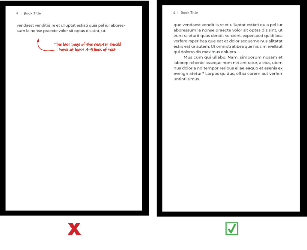
- Number of Lines
The last page of the chapter should have at least 4–5 lines of text, if at all possible. - Running Headers
If the last page of your chapter is entirely blank (to preserve title page order on the recto side), then no running header should be applied. The page will be entirely blank.
Ellipses
If you are working in Adobe InDesign, you can see a visual representation of the invisible punctuation used in your document, indicated by the light blue dots and carats in my examples above. Navigate to:
View>Structure>Show Structure
To insert a nonbreaking space in Adobe InDesign, navigate to:
Type>Insert White Space>Nonbreaking Space
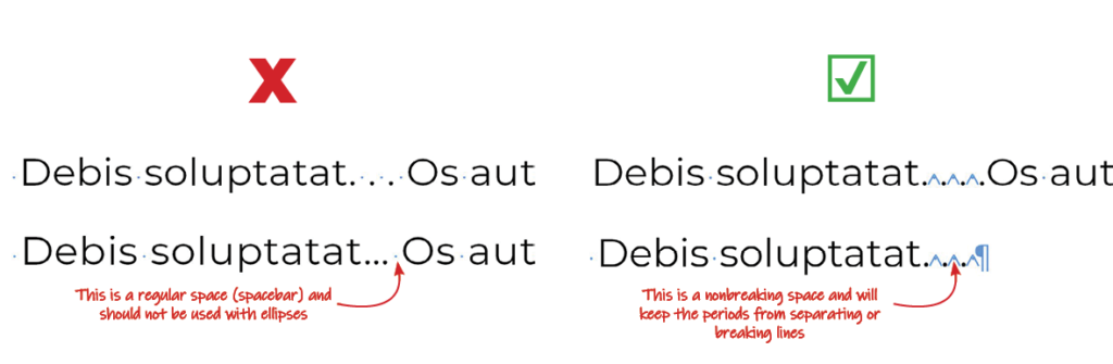
Ellipses are one of the most confounding subjects to research in the graphic design world. It’s rare to find two sources who agree! While a majority would advocate for the use of an ellipse glyph (a … contained within a single character file), the Chicago Manual of Styles prefers another method.
Check for:
- Ellipse Characters
Although it seems counter-intuitive, the Chicago Manual of Styles does not want ellipse glyphs used in the text. - Periods with Breaking Spaces
The familiar dot-space-dot-space-dot is another no-no. This kind of formatting will not keep the periods together and they can become separated across line breaks or even pages.
Do Instead:
- For an Excerpt
For an excerpt in the middle of a quote, use this format:
period—nonbreaking space—period—nonbreaking space—period
For excerpting the beginning of a sentence, the following sentence’s period becomes part of the line-up:
period—nonbreaking space—period—nonbreaking space—period—nonbreaking space—period - For the End of a Line
If the ellipse follows at the end of the line due to a discontinued thought or an excerpt, then the format is as follows:
period—nonbreaking space—period—nonbreaking space—period—nonbreaking space—end of paragraph
Dashes
EN DASHES and EM DASHES refer to the length of a dash in a typeface. Naturally, the EN DASH is the length of the letter “n” and the EM DASH is the length of the letter “m.”
In Adobe InDesign, these dashes can be inserted here:
Type>Insert Special Character>Hyphens and Dashes
Dashes are seen and used in almost every way imaginable, especially on social media. We have become accustomed to seeing regular dashes used in place of a proper en or em dash (mostly due to the fact that our keyboards are not naturally equipped with these!)
Check for:
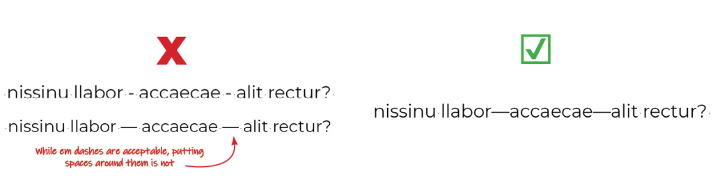
- Regular Dashes
These should not be used anywhere! The only exception is hyphenated words (like pick-me-up). - En or Em Dashes with Spaces
These dashes should always bump up against their neighbors without any white space.
Do Instead:
- Em Dashes For Explaining a Clause
Em dashes can be used in place of a colon or semicolon. They help to summarize or expand upon the following clause. Examples:- Grandma loved—with her homegrown tomatoes—to cook spaghetti sauce.
- Inside the sauce were my favorite ingredients—tomato, basil, cilantro, and onion.
- En Dashes for Increments
En dashes indicate a span of time, numbers, or dates. Examples:- 9 a.m.–1 p.m.
- 12,000–15,000
- June–August
- Regular Dashes for Hyphens
Regular dashes are used as hyphens in some compound words. Examples:- Pick-me-up
- Self-esteem
- Anti-virus
Additional Information
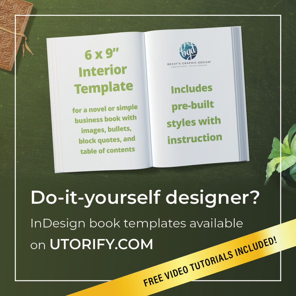
- Need help with a book design project or self-publishing? Schedule a meeting with Becky.
- Enjoy a free, downloadable .PDF version of this guide here.
- Check out our YouTube channel for other design tips and tricks!