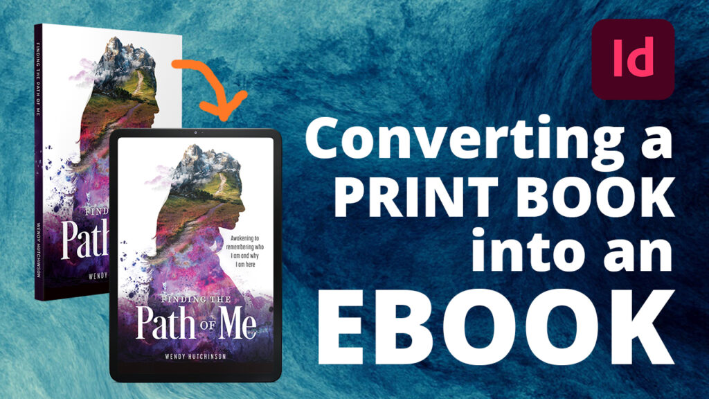
If you’ve ever wondered if your eBook can be functional and beautiful, the answer is yes!—but only with the correct foresight. It’s common knowledge that eBooks often trade the visual beauty of a printed book for utilitarian functionality. Lose the artistic accents of design, but gain the ability to search for keywords or phrases in the document.
Why can’t we have both? With the proper planning (and a dash of technical talent), it is possible to create highly operable—yet pretty—digital versions of our books.
For proof, check out our beautiful eBook sample here.
 From the Get-Go
When I am planning a new, from-scratch book project, I spend much time considering the technical limitations of the project in comparison to the client’s desires. Let’s say I have an author who desires to have QR codes inserted into their printed book. Those won’t function in the eBook edition unless the reader has two devices available: one to view the eBook, the other to scan the code. So, I make the QR code image clickable with a link to the desired URL.
It is well-known that an eBook is essentially a simplified website, built from HTML and CSS code, then contained in a .epub file. This file is then downloaded to your eBook-reading device and is interpreted as best as the device is able. Depending on the device, the book’s visual appearance will vary. For example, a newer Kindle device might contain the font “Open Sans,” but an old device won’t have that font, so the ePub is programmed to swap in the next-closest thing, which will likely end up being “Helvetica.”
When building a book file from the ground-up, I think about both the print and ePub editions as I would a website. Everything should be properly labeled and organized, not just visually, but with clean background code.
Analogy: Reflowable content beads on a string
Imagine that each paragraph, image, table, chart, and item in your book is represented as a bead. The beads are scattered across your craft table. Assembling the beads into your desired pattern, you place them one after another into the lineup. Once you finish, however, you realize there is a mistake in the pattern! You simply cannot ignore the mistake, so you carefully attempt to insert one more bead into the line. Bam! The beads scatter across the table, unable to accommodate the addition.
 You groan. Ah! You begin to reassemble the whole thing from scratch, but this time, you thread the beads onto a string as you go. This ensures that they cannot roll away as you work. The beads are able to slide to the end and you play extra slack into the line when you need more space.
When you finish, you’ve got a completed necklace! Because the beads are threaded, you can safely pick up and move the beads without fear of them rolling away. In addition, you could feed the pattern onto a different string, a metal rod, or a jewelry chain. The beads are now reflowable.
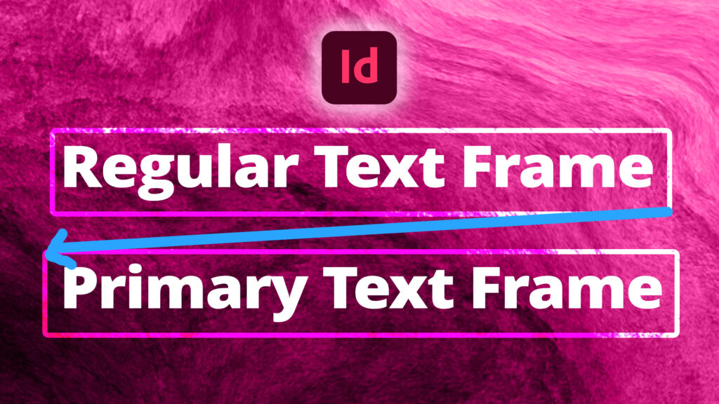
In the same way, we want our book content to “reflow.” Everything should be connected to the main “string,” or primary text frames, of the document. Graphic elements like images or tables should be “anchored” into the main string, not left sitting on the table nearby. In doing so, when we add more beads to the beginning, everything following can push along the string.
Two birds with one stone
When setting up my book document, everything is attached to the main text flow. This is beneficial and time-saving down the road, because when it comes time to export an ePub, InDesign is able to extrapolate clean, chronological code from the original print file.
If you notice something out-of-place in your ePub file, it’s likely that it has not been anchored! Unanchored objects generally “fly away” to the end of a chapter or book.
Pros and cons: Reflowable worth it?
While it is generally considered a visual “downgrade” in comparison to the print edition, the ePub edition of a book can host specialty features impossible on paper. For example, you may print your book in grayscale to save money, but there’s no reason to avoid color in the eBook! There is no additional cost for this.
You might say, “But Kayla, it’s sooooo much easier for me to just export a fixed format version of my eBook! Why go through all the trouble of making a nice reflowable one?”
My answer is this: look at the following pros and cons. Fixed format is the “eBook easy button,” but has very little advantage except in the instance of children’s books.
In the eBook version, I have room to allow the images to grow to full width, whereas the print version was limited to the small blocks all contained on one page.
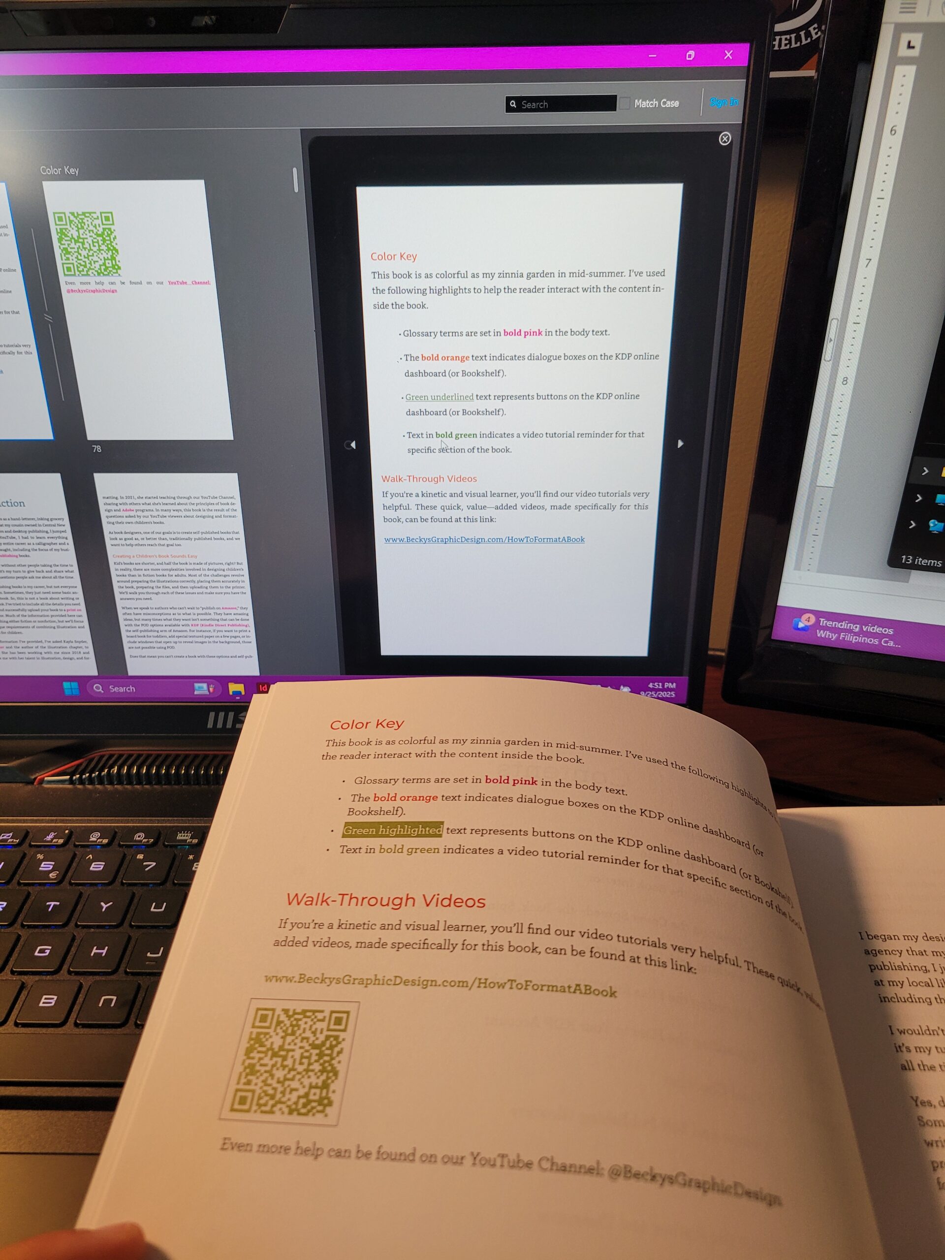
The eBook color key had some limitations, such as the shaded green text. This had to modified instead to just an underline.
It is possible to “text wrap” an object in your eBook! For example, this orange square and its text were rasterized into an image, then anchored into place with a “Float Right” and “width: 50%” assigned in the CSS.
In both the print and eBook editions, this image is displayed at full size. eReaders are able to zoom in on the graphic for easier viewing.
Shaded or colored backgrounds are not possible in eBook form, since the reader has control over the dark/light settings.
Reflowable eBook Shortcomings:
- No ability to embed fonts. Your reader “gets what they get.”
- No ability for background color except for shaded paragraphs
- No “full-bleed” imagery
- Limited font-styling options (character styles)
- More technically involved to make it pretty
Reflowable eBook Advantages:
- Color doesn’t cost more! Add those full-color images!
- Add color to your text styles at no cost
- Images can be set to preview large, even if they’re small in the print edition
- Users can zoom in on images
- Users can increase the font size if reading is difficult
- The Table of Contents and outbound hyperlinks are clickable
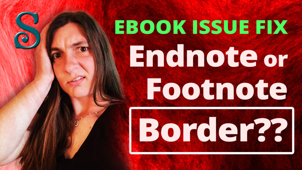
- Footnotes/Endnotes can be contained in interactive pop-ups
- Content and keywords are searchable
- Users can make notes and bookmark important sections
Reflowable InDesign Video Tutorials
Flowing standard frames into primary
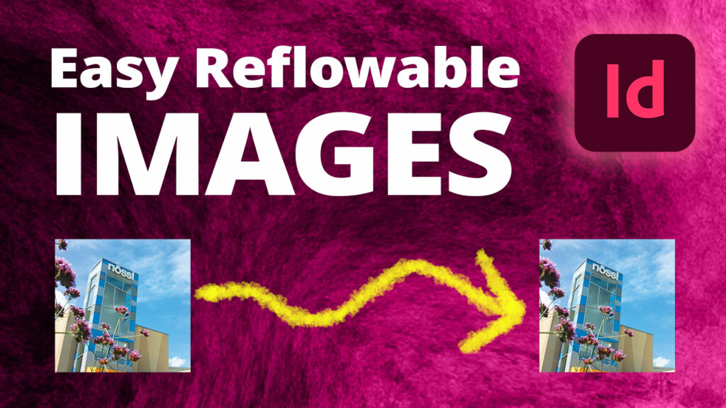
Reflowable images in a long document
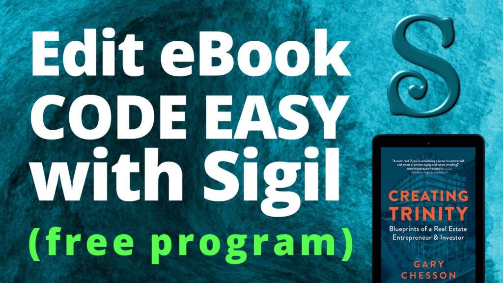
Free ePub editor, Sigil
Utilizing primary text frames

Reflowable long document styling process
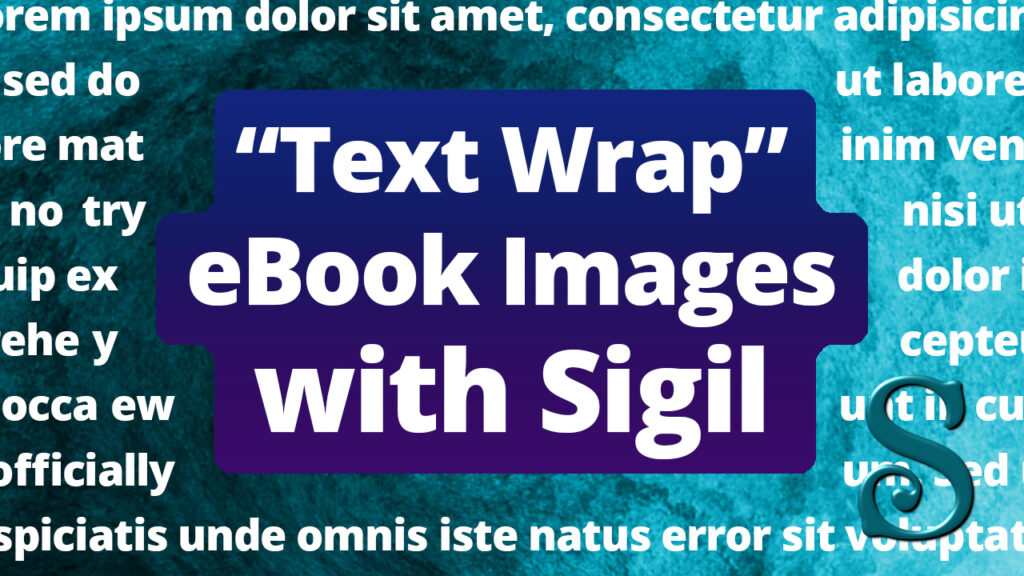
How to “text wrap” eBook images
Converting a non-reflowable print book into an eBook